ACG112 Electronic Illustration
"2D/3D crests" Project: Creating an Environment
- Today's Goal
- Create an environment for each crest with additional element(s) that interact with the crest.
- In this third step of the project, you return to each of the crests and complete the composition.
- The current drawings are rather stark, with the crest floating on the white of the page. We want to add an environment made of one or more additional objects of your choice.
- To increase visual interest, the new object(s) should interact with the crest. Interaction can involve your choice of solutions. The following are only some suggestions:
- The crest leans or rests on the new object.
- The crest casts a shadow on the new object.
- The crest is reflected in the other object.
- The crest is intertwined with the new object.
- The crest shows through a transparent or translucent object.
- The crest is illuminated by the new object.
- On the file server you will find examples of some of these solutions as they apply to the five crests. Again, these are only examples--you should strive to develop your own ideas.
- Some techniques you may find useful in completing your images:
- Transparency
- A major new feature of FreeHand 8 are 'lenses', which are dynamic effects (they change as the objects they apply to are edited) including transparency.
- Lenses are applied as fills. Select the object, display the Fill Inspector (click the middle tab in the Inspector palette), choose 'Lens' as the fill type from the first pop-up menu at the top, then choose 'Transparency' from the second pop-up menu.
- The current version of PostScript (the graphics language underlying both Illustrator and FreeHand) renders all objects fully opaque. To be compatible with PostScript, FreeHand often needs to convert lens effects (including transparency) into complex files.
Here is a workaround for achieving transparency effects in a more limited way, but without possible compatibility problems:
- Arrange two closed paths (with Basic fills of different colors) so that they partially overlap.
- With both paths selected, use the menu command Modify-->Combine-->Transparency. Adjust the slider to determine how transparent the top object should appear.
- Notice that the program achieves the look of transparency by creating new path(s) that span the intersection(s) of the two original paths and are filled with some combination of the original colors
- If later on the original objects are modified, the paths resulting from the transparency operation will not update automatically. Rather, they must be deleted and the effect
applied again.
- Transparecncy effects, besides suggesting glass and other see-through materials, are also used when a shadow is cast on a complex (multi-object) background:
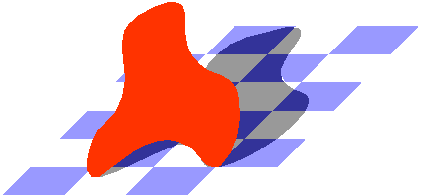
- An example of how this technique can be used is in the file 'Pedestal Flower transparency'
- Reflective surfaces
- The most basic way to achieve a reflection effect is through the use of the Reflection tool. However, if other transformations are applied (such as Skew), the order of the transformations matters:
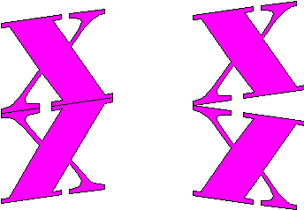
- In the example on the left, the letter 'X' is first reflected. Afterwards the original and reflected copies are skewed to suggest perspective.
- In the example on the right, the letter 'X' is first skewed. When it is afterwards reflected, the mirror-image-in-perspective effect is lost.
- The reflected image should also be cropped to the outline of whatever reflective object it is reflected in.
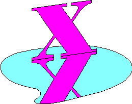
- In the example above, the letter 'X' is reflected in the irregularly-shaped pool.
- The path representing the pool was overlapped on the reflection of the crest. The reflection was then selected and Edit-->Cut used. Finally the pool was selected and Edit-->Paste Inside used.
- An important clue of a reflected image is a color cast due to the reflecting surface properties:
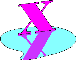
- In the example above, the reflection of the letter 'X' has a cyan cast to complement the color of the pool.
- The color cast can be introduced directly using the sliders in the color mixer. If the reflection was already pasted inside, it must be direct-selected (Option-click) to see its color in the Fill inspector. The color can then be dragged to the color mixer and modified.
- You can also experiment with the Modify-->Combine-->Transparency command described above (do this before pasting inside)
- Soft shadows
- Under many lighting conditions, the edges of shadows are not perfectly sharp.
- Assuming a solid color background, this can be easily simulated by using a blend.

- In the example above, the shadow of the letter 'H' was first cloned. The clone was then inset using the Modify-->Alter Path-->Inset Path command (set the slider to a positive number to shrink the selected object). The original shadow was filled with the same color as the background, the shrunken copy was filled with a darker color.
- To blend and avoid distortions, make sure to select a point on one path, and a corresponding point on the other path. Then use Modify-->Combine-->Blend.
- Examples of this technique are in the files '3-arm on pedestal' and 'Quarter-moon reflected'.
- Casting shadows on irregular objects
- If the shadow of the crest is cast on a surface not large enough to accommodate it entirely, it needs to be cropped to the edges of the object.
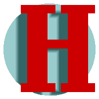
- Besides using Paste Inside (as in the reflection technique), you can also use the Crop command. The trade-off is that Paste Inside allows you to reposition the objects later, while Crop may reduce the size and complexity of the file by throwing out unseen details.
- Note:If the shadow, as in this case, is made up of a blend, it must be ungrouped before Crop can be used. You will need to use the command Modify-->Ungroup twice to completely ungroup the blend.
- In the example above, the bakground circle was cloned, and the clone brought to the top of the drawing (Modify-->Arrange-->Bring to Front) in preparation for cropping.
- Finally, the clone of the circle and all the elements in the shadow were selected, and Modify-->Combine-->Crop was used.
- If the shadow is cast on objects with multiple surfaces, it must be duplicated (and possibly transformed and cropped) to accommodate the various elements it is cast on.
- Examples of these techniques are in the files '3-arm on pedestal' and 'Tile spotlight'.
- Lighting effects
- The effect of a spotlight shining on a wall can be simulated with a radial gradient

- The softness of the edges of the spotlight is adjusted by sliding colors along the gradient bar in the Fill inspector.
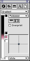
- An example of this technique is in the file 'Tile spotlight'.
- Intertwined shapes
- A limitation of vector graphics is that each shape is a 'rigid object'--it cannot be partly in front of, and partly behind, another object.
The workaround for achieving intertwining effects is to break up the objects into sections. Assuming the paths are only filled (not stroked), the process is straightforward, if somewhat time consuming.

- The basic strategy is to create additional 'patch' objects in the same color as the back object. Wherever the patches obscure the front object, there the back object appears to come forward.
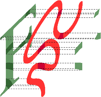
If you could see the intertwined squiggle and 'F' in our sample picture from a 'side view', you would be able to see how the green patches (on the right) cover up parts of the orange object (in the middle), thus making the green object (on the left) appear to be in front.
- A shortcut to create the required patch shapes is to use the 'Intersect' Boolean operation.
- Select the objects involved (in our example, the capital 'F' and the squiggle).
- Edit-->Clone.
- While the clones are still selected, use Modify-->Combine-->Intersect.
- If the resulting shape is a composite path (the Object Inspector will tell you), then use Modify-->Split to undo the composite and obtain regular paths.
- Deselect all. Now select each of the patches where you want the original front object to be in front, and delete them.
- Examples of this technique are in the file 'Maze with vine'.
Copyright 1998-2000 by Sandro Corsi. Last modified 11 MAR 1999.